Posts

Yayoi

Image
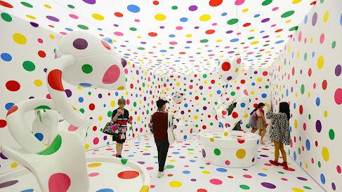
Yayoi Kusama is one of those artists who is both deserving of their commercial success and seemingly unimpacted by it. According to artnet, she is the 3rd most expensive living female artist, and compared to other millionaire makers who produce pop-y, market friendly work, like Jeff Koons and Anish Kapoor, she is actually somewhat interesting. The most inspiring thing to me about Kusama is the way, or rather the amount, that she works. At 92, she still goes into the studio everyday and makes art with her own hands. At her level of success, she could work exclusively with an army of assistants and basically license out her aesthetic -- but she has not done that, because she is obsessed with material and pattern and form and color, not making fucking money. I want to be like her. I want to die at 95 with a camera in my hand and $7 in my bank account. I want to be so fucking worked up over making the world look weird that it gets in the way of my everyday life.           Adams, Tim. “Yayo

Final Project - My Breakouts!

Image
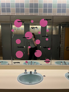
I decided to call my final project "Charlie's Breakouts." I think it sort of references illness or acnes -- like the Wriston is having a bad skin day or has just come down with a case of the chickenpox. It was a lot of practical fun learning how to use the vinyl cutter. I think machine cut vinyl can add an air of professionality to a piece, and I am looking forward to using it more. Like, even though the process of fabricating these decals was relatively straight forward, I think they look technically very nice. It's a lot easier to make a perfect circle with a CNC razor blade than with a paint brush.  Although I think putting dots all over Warch would have been a ton of fun, in the end I am glad I did my project in Wriston. I have had such a stressful term, and putting that together might have sent me over the edge. It also gave me the opportunity to spread out over an entire building and play with the idea of heightened perception that we talked about in class. Beca

Muddy Muddy Show

Image
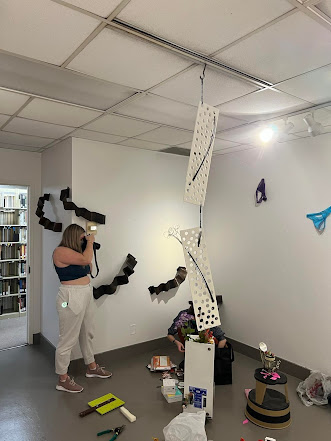
The group project was a lot of fun and very exciting creative task! Normally, most of my artistic practice is just me. I spend a lot of time behind my computer screen or in the sculpture studio working by my own sad self. It was really eye opening to make art as a group and respond to people creatively. Putting those metal pieces on the wall with Chapin was sort of like a dance -- the two of us were able to work together to make one thing happen. It was also just such a stress reliever! I have gotten way to serious about basically everything in my life recently I think. It's all bills and doctors appointments and credit scores and attempts at "good art" with me these days. It felt SO SO good to rip up paper and draw on walls and act like a seven year old for a few hours.  Technically, seeing how to set up a scrim in a space like this and project video onto it was very useful. Pairing the work out video with the chanting totally changed the space, and playing ASMR in there

Convocation Reflection

I don’t know if I like Alexandria Bell's work. She messes with text and newspapers to draw attention to how public narratives are constructed. However, she comes from a journalistic background, and I think it shows. Her edited New York Times covers don’t have a lot of visual interest – at least to my eyes – and to understand what she is doing, I think you have to read about her work or attend a lecture about it. If that’s the case, I don’t know why she wouldn't just cut out the middleman and write an essay. I know she said she's not super interested in doing that – she mentioned she doesn’t want to work at a paper, she isn’t a journalist, etc. – but to me, it feels like her critiques could be better expressed through straightforward writing. When she was still wheat pasting her images, I’m guessing they had a greater impact, and in the Q&A, she basically said as much. But I also recognize that it is a lot easier to feed yourself as an artist when you can frame and sell

Installation Sensation!

Image
I love looking at Yayoi Kusama's work. She transforms spaces into highly graphic experiences, and I want to try and emulate that with my project. So, I am proposing a piece where I polka dot Warch! I want to make circular pink stickers using the vinyl cutter in the maker space and put them on the floor of the campus center. I also want to make black "squiggle" descales that will overlap the dots and provide visual interest.  Things that need to happen to make this happen: Get approval from the building manager of Warch, campus safety, and the provost Perhaps make a test install in Wriston to show that this is safe and will not harm terrazzo floors Make an SVG template with dots and squiggles Secure vinyl -- either purchase it myself or see in Angela in the makerspace can use school funds Find a group of friends to help with the install Cut out decals Install, preferably on a weekend in the pm (after 10) Remove, maybe four or five days later

Sculpture

Image

Another Transfiguration

Image
Another Transfiguration I did a lot of transparency printing for my 3D art class last term. When you print out a high contrast image on acetate transparency paper, you’re left with a graphically simplified but interesting result. I love layering multiple prints on top of one another; taking a stack of three or four photos and skewing two of them slightly to the left or flipping one around and one on its side. The result is almost a graphical representation of the phrase e pluribus unum. You take all these different things, smash them together, and what emerges is something totally unique.  I noticed a similar effect playing out when I looked at personal and institutional pandemic responses. Everyone has been layering their own shit on top of the pandemic, and in turn, the pandemic flips things around and distorts them —but not in a totally random or unpredictable way. The last of an acetate composite print is not random; it doesn’t look like it came out of a blender. Inste